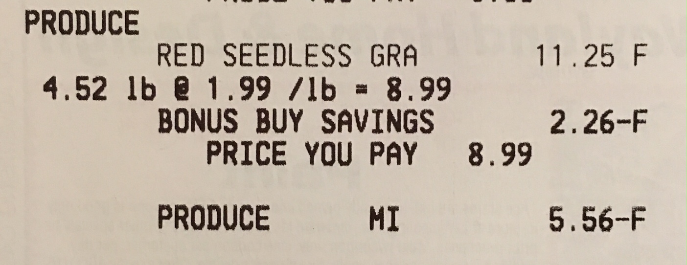
 The grapes were on sale, $1.99. But, with a $25 purchase and coupon from my store flyer, $0.97 per pound. When I went to buy the other items, the chicken I wanted was out of stock. I got a raincheck, and at the same time, asked the customer service person if they’d honor the grape sale even though my order was under $25. They agreed, but good luck trying to override anything on a cash register. The cashier couldn’t figure it out and the manager finally came over and couldn’t do it either. Finally, he said he’d just enter a credit. Now, $1.03/lb discount times 4.52 lbs might be tough to do in your head. $1 times 4.5 is $4.50. The extra .03/lb gets us to $4.63. I’d have been happy with $4.50, I just wanted to leave. $5.56 is what he entered as a discount. Final cost $3.43 for 4.52 lbs. We need smarter cashiers or Siri-enabled registers.
Don’t ignore scale
I read a question on the Skeptics StackExchange site titled Does this map show every car bomb explosion in Baghdad since 2003? along with this image –
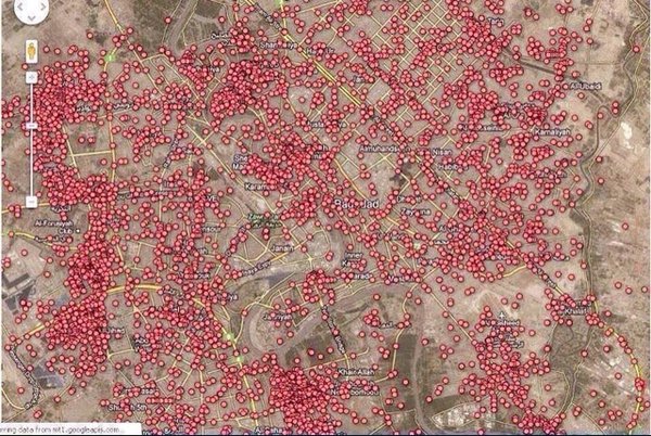
As I looked at it, three things occurred to me. First, violence is awful, the ideal number of violent deaths per year is zero. Second, the image is a time-lapse, accumulated over 13 years. And last, the size of the red dots are misleading. zoom out much further and the image is a solid red blur. Zoom in, just a bit more, and you’ll have some sanity –
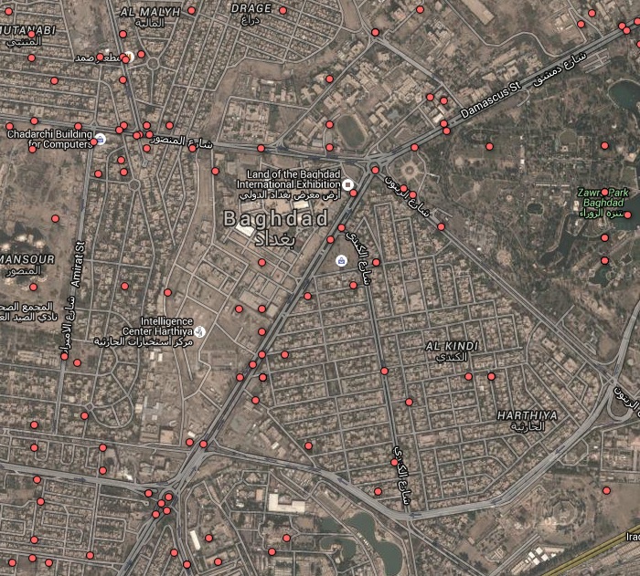
The answer to the original question is “no,” these were total deaths, not just car bombs. But the important issue, that the map’s scale implied far worse than reality, was something the members of Skeptics weren’t interested in. When I found the data source, and rescaled the image, my answer was closed as “original research.” Suffice it to say, the US city of Detroit averages 300 homicides per year, so nearly 4000 over the same 13 year period.
You can look at this and decide whether the original image was fair or misleading. My only point today is that scale can’t be ignored.
Discounts on My Sunday Paper
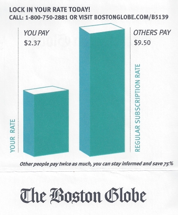 “Others pay twice as much.” And yet, I’m saving 75% if I take this deal. The deal is better than the copy reads, but still, the math is just awful.
Do you have any examples like this? Please click above to submit or forward to me at badmath at b-1.org.
Growth and Decay
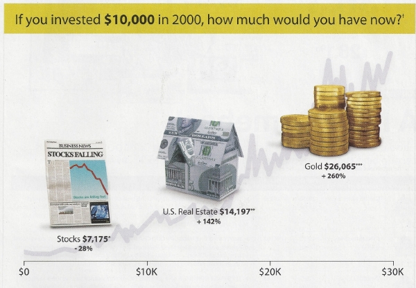 This is an ad I set aside some time back. It took a few seconds to see what I found so wrong with this ad. Was it that this chart had no vertical axis, showing investment return over time? No.
It was the failure of the marketing department to catch the simplest of math errors. When we see a price rise from $10,000 to $14,197, it’s 5th grade math that will tell us the percent growth. 10000/14197 = 1.4197 or a 42% rise. Similarly, The $10,000 rise to $26,065 isn’t “Up 260%”, it’s actually up 161%. They can have their 1% extra due to rounding.
In the US, there’s a TV program called “Are You Smarter than a 5th Grader?” In the case of whoever edited this copy, I believe we have our answer.
A False Correlation
Some time ago, a bit of news came out, “Coffee drinkers have a higher cancer rate than non coffee drinkers.” My immediate response was “false correlation.” My wife asked me why professionals would issue a report that was not only flawed, but flawed so badly that it took me seconds to reach that conclusion. That’s actually the tough part of this. Let me explain the easy part, how false corrections can easily produce bad results.
I’ll use a population of 10,000 random coffee drinkers. They are surveyed and discovered to have a cancer rate of 5%. Those conducting this experiment find a 3.3% rate of cancer in the general population, and even with margins of error (I’ll pass on that math for this article) the 5% rate they see is significant, 50% more instances of cancer than expected.
Let’s look at the data that might have revealed the error made.
- Cigarette smokers show a 10% rate of cancer
- Non-smokers show a 1% rate of cancer
- Random population shows 25% smokers
You can already see where this is going. The study was conducted to understand if coffee drinkers had a higher rate of cancer. So far, I’ve jumped to data regarding smoking. To continue –
- Coffee drinkers reveal a 50% rate of smoking (Not likely the case, I exaggerate a bit to make a point)
Now, in a population of 10,000 coffee drinkers, the 5,000 smokers would be expected to have 500 cancer instances and 5000 non-smokers, another 50. When this is taken into account, the resulting 500 cancer results are actually a bit lower than expected. New headline? “Coffee may reduce cancer rates for smokers.”
The above is a bit of an exaggeration.The truth is, press releases rarely offer the data behind the conclusion, leaving the reader to decide whether the headline is worth researching or giving any credence at all. It was only a few month later that I read new reports that reached the same conclusion I did. That coffee drinkers tended to have more smokers that non-drinkers. In the end, even the so-called pros make mistakes.
Do you have any examples of similar error in data analysis and false correlation? Send me a note, I’d be happy to print it.
4 times less?
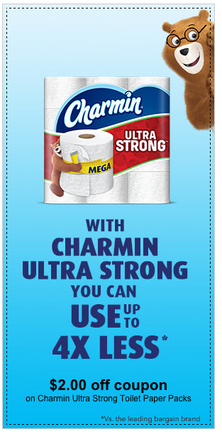 I’ve seen a few instances where instead of writing “you’ll use 1/4 the amount” the ad states “4 times less.” This practice may be getting more common, but it’s bad math and ambiguous English. Say, for example, I have 4 slices of pizza. You have one. When using addition or subtraction for a comparison, I have 3 more slices than you, and surly, you have 3 fewer. Multiplying doesn’t work the same, I have 4 times the pizza you do, and you have one fourth as many as I. To say you have four times fewer makes no sense.
Do you have any similar examples? Send them in. Just hit “submit an example” above.
Cutting a board
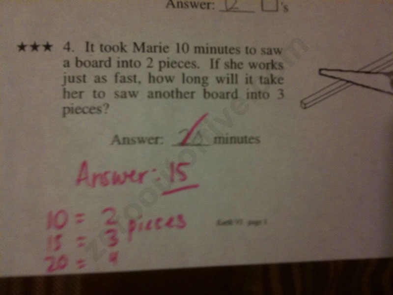 I saw this online a couple years ago, and saved the image. It was posted on Stack Exchange as
A “simple” 3rd grade problem…or is it? by the member with username Enigma.
What’s disturbing here is that the student got the question right. And I suspect many, or most of the students produced the same wrong answer the teacher expected. Do you see the issue?
If I were the student…. pause, I am 50+, but I remember grade school vividly. The school I went to did not have teachers for single subjects. Up till 8th grade, it was one teacher all day. Math was my passion, but not hers. I learned how to politely point out errors, made by either teacher or the published materials we used. Now, the clarifying moment would come by asking the teacher to continue the chart she produced. “5=1 pieces”? No, you don’t cut for 5 minutes for 1 piece. It’s there at 0 time.
- 0 min = 1 piece
- 10 min = 2 pieces
- 20 min = 3 pieces
The source of this misunderstanding is twofold, the 10 minutes is one cut, it’s the same time to go from 5 pieces to 6. Second, the teacher should not have insisted, but should have used further analysis as I did to better understand the relationship between variables.
Discount Innumeracy

This was the text that came in an email I received today. It falls into the category of minor mistakes, but big enough to catch my eye. 10 apps at $10 is $100, 80% off is $20, anything lower is “more than” 80% off, not “nearly”. Not a big deal, but a copy editor should catch this.
Falling Objects
 I spend 2 days a week working for the math department at a local high school. One day, I was working with a student who was using the equation for a falling object, h=16t^2, and she was calculating the time for a rock to fall off a very tall building. The student used her calculator and the answer was 884 seconds. Hmmm. I asked her if she was certain of her answer. She pointed to the calculator, and there’s the number. Calculators are never wrong.
I asked, “how many seconds in a minute?” 60, of course. How many 60s in 884? No calculator, just round it, 60 into 900 is 6 into 90, or 15. 15 minutes. It hadn’t sunk in yet. So I keep pushing. “You see your friend wave, at the top of the Empire State Building. She drops a baseball. You go into a Starbucks, buy a coffee, stop in the restroom, and come back 14 minutes later, to see the baseball still falling? She responded, “Ok, now you’re making fun of me.” Perhaps, but at the moment for me was the disconnect between the word problem and the numbers. I think there’s a skill worth teaching, estimating the expected answer in a way that would help prevent such gross errors. The correct answer was 8.84 seconds for a 1250 ft tall building. I’d hope a student would be able to take a moment and say she expects a range between say, 5 and 15 seconds.
Two Billion Examples of Innumeracy
John Quiggin has a blog with the tag line “Commentary on Australian & world events from a social-democratic perspective,” offering intelligent discussion on a mix of political and economic topics. This particular article, Two Billion Examples of Innumeracy, discusses the notion that 2 billion people would be watching the British Royal Wedding. It doesn’t take too much logic to look at the world population and realize that 2 billion is an absurd number. Over 1/4 of the world is living without electricity, and when you continue looking at the facts, it comes down to some sub 500 million number. One web site put the final number at 300 million or so. In line with John’s estimate of 250M as a high end number.
What’s important here isn’t getting the number accurate to 1% or even 10%. It’s being off by a factor of 7 that’s so unsettling. Estimating large numbers with a 50% accuracy has its place, and this is one example of the media getting it so wrong.