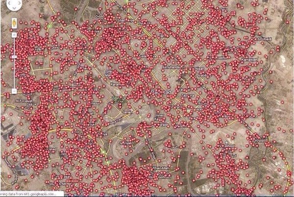
I read a question on the Skeptics StackExchange site titled Does this map show every car bomb explosion in Baghdad since 2003? along with this image –

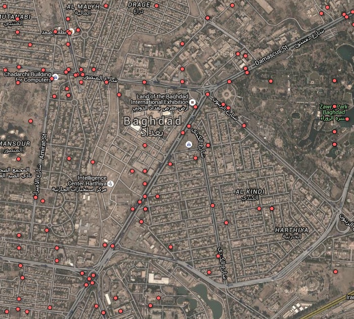
As I looked at it, three things occurred to me. First, violence is awful, the ideal number of violent deaths per year is zero. Second, the image is a time-lapse, accumulated over 13 years. And last, the size of the red dots are misleading. zoom out much further and the image is a solid red blur. Zoom in, just a bit more, and you’ll have some sanity –

The answer to the original question is “no,” these were total deaths, not just car bombs. But the important issue, that the map’s scale implied far worse than reality, was something the members of Skeptics weren’t interested in. When I found the data source, and rescaled the image, my answer was closed as “original research.” Suffice it to say, the US city of Detroit averages 300 homicides per year, so nearly 4000 over the same 13 year period.
You can look at this and decide whether the original image was fair or misleading. My only point today is that scale can’t be ignored.